60-30-10 Rule: 11 Stunning Colour Ideas for Every Room
11 Gorgeous 60-30-10 Colour Combinations for Your Dream Home
If you have ever stood in a paint aisle feeling completely overwhelmed, you are not alone. Choosing colours for a room is one of the trickiest parts of designing a home, and it is exactly where most people get stuck. The good news? There is a simple designer formula that takes the guesswork out of it: the 60-30-10 rule. Once you understand it, every room you design will feel balanced, intentional, and magazine-worthy.
In this guide I am sharing 11 beautiful 60-30-10 colour combinations you can use for your interiors (and even your home exterior). Save your favourites, pin them, and use them as a roadmap the next time you pick up a paintbrush.
What Is the 60-30-10 Rule?
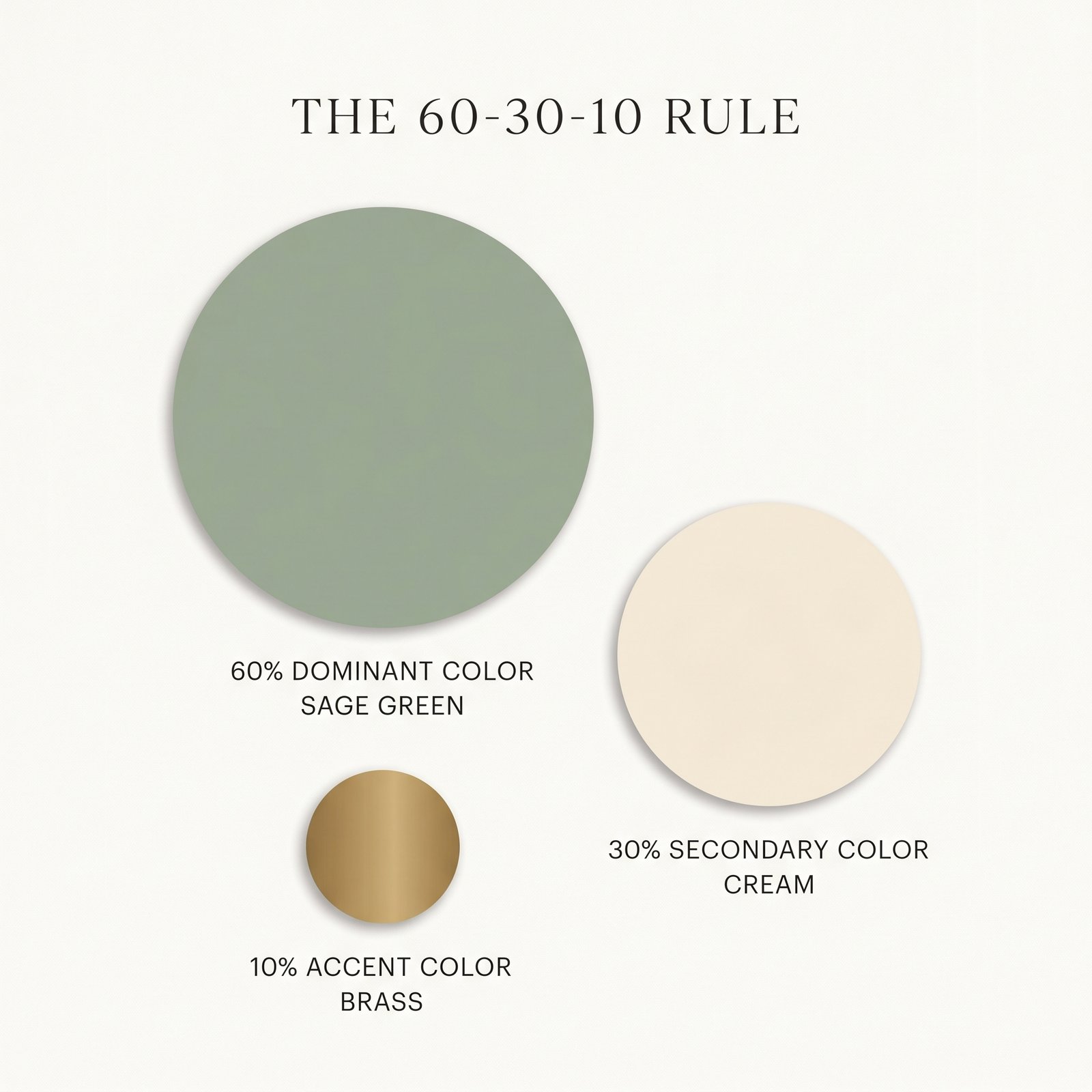
The 60-30-10 rule is a classic interior design principle for splitting colour in a space so it always looks harmonious:
- 60% — Dominant colour: the main backdrop of the room. Think walls, large rugs, and big furniture like sofas or beds.
- 30% — Secondary colour: the supporting shade that adds depth. Think upholstery, curtains, an accent wall, or bedding.
- 10% — Accent colour: the small pop that brings everything to life. Think cushions, artwork, vases, lamps, and decor.
The magic is in the ratio. When colours follow this balance, your eye knows exactly where to rest, and the room feels designed rather than thrown together.
Which Colours Work Best in Which Room?
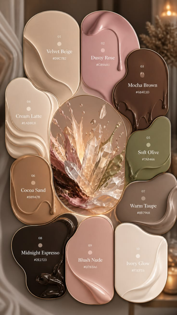
Before you pick a palette, it helps to understand a little colour psychology — different rooms have different jobs, so they call for different moods. Here is a quick room-by-room guide:
- Bedroom — calm and restful: Soft, muted tones help you wind down. Reach for sage green, dusty blue, blush pink, lavender, and warm neutrals. Avoid bright reds and intense oranges, which can feel too energising for sleep.
- Living Room — warm and welcoming: This is where people gather, so it should feel inviting. Greige, taupe, warm white, navy, and earthy greens work beautifully, with bolder accents like mustard or terracotta to add personality.
- Kitchen — fresh and clean: Crisp and light colours keep a kitchen feeling hygienic and bright. Cream, sage green, soft yellow, white, and powder blue are all excellent. Sage green cabinetry in particular is a huge favourite right now.
- Bathroom — spa-like and airy: Cool, watery tones make a bathroom feel like a retreat. Think powder blue, soft white, pale grey, and gentle teal. These shades also bounce light around small spaces.
- Dining Room — rich and appetising: Deeper, warmer tones create intimacy and are known to stimulate appetite and conversation. Forest green, burgundy, chocolate brown, and warm terracotta are ideal here.
- Home Office — focused and grounding: You want calm energy that helps you concentrate. Charcoal grey, navy, olive green, and warm white reduce distraction while still feeling polished.
- Kids’ Room / Nursery — cheerful and gentle: Soft, happy colours without being overstimulating. Dusty blue, soft yellow, pale green, and gentle pastels keep the space playful but soothing.
- Entryway / Hallway — bright and inviting: Since these are usually smaller and darker, lean on light, warm neutrals like off-white, cream, and soft greige to make them feel open.
A quick rule of thumb on warm vs. cool: Warm colours (reds, oranges, yellows, terracotta) make large or cold rooms feel cosier. Cool colours (blues, greens, greys) make small or busy rooms feel calmer and more spacious. Keep this in mind as you read through the palettes below — and notice how each one is matched to the rooms it suits best.
Now let’s get to the palettes.
1. Soft Greige + Warm Taupe + Terracotta
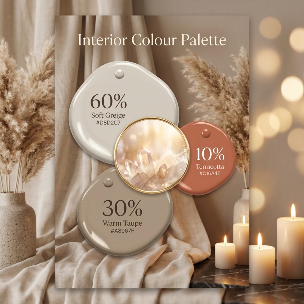
A timeless, cosy neutral scheme that never goes out of style.
- 60% Soft Greige (#D8D2C7) on the walls and main sofa
- 30% Warm Taupe (#A8967F) on curtains, rugs, and an armchair
- 10% Terracotta (#C16A4E) in cushions, pottery, and throws
Best for: living rooms and bedrooms that should feel warm and grounded. The terracotta keeps the neutral base from feeling flat.
2. Sage Green + Cream + Brass
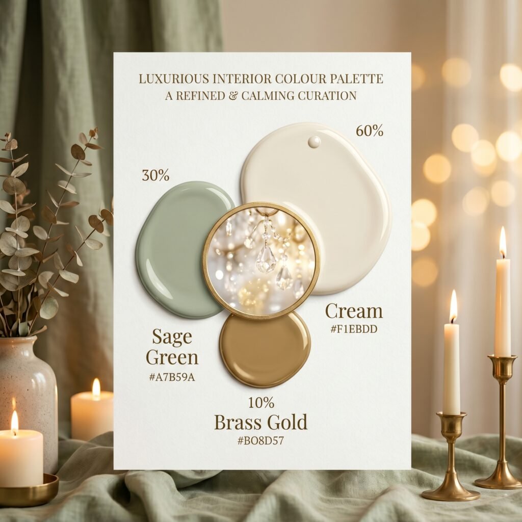
An organic, calming palette that has been everywhere on Pinterest for good reason.
- 60% Cream (#F1EBDD) on walls and large furniture
- 30% Sage Green (#A7B59A) on cabinetry, an accent wall, or sofa
- 10% Brass / Gold (#B08D57) in light fixtures, frames, and hardware
Best for: kitchens, bedrooms, and reading nooks. The brass accent adds a quiet touch of luxury.
3. Navy Blue + Crisp White + Mustard Yellow
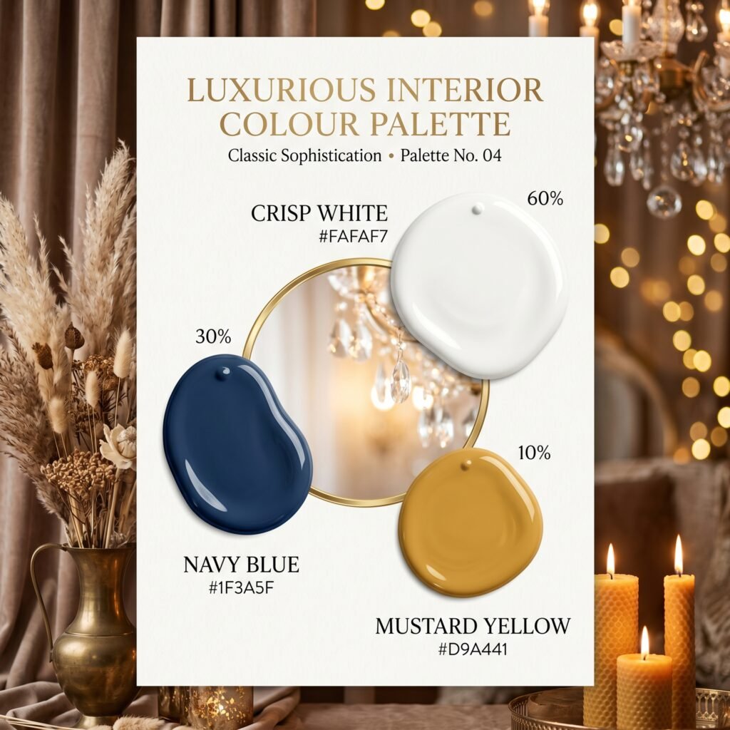
Bold, classic, and full of personality without ever feeling loud.
- 60% Crisp White (#FAFAF7) on walls and ceilings
- 30% Navy Blue (#1F3A5F) on a feature wall, sofa, or cabinets
- 10% Mustard Yellow (#D9A441) in pillows, art, and a throw blanket
Best for: living rooms and home offices. This combo also works beautifully as a coastal exterior scheme.
4. Warm White + Charcoal Gray + Forest Green
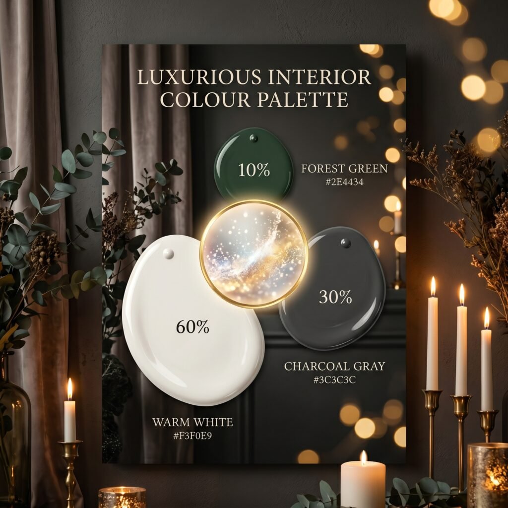
A moody, modern palette that feels sophisticated and grown-up.
- 60% Warm White (#F3F0E9) on walls
- 30% Charcoal Gray (#3C3C3C) on a sofa, large cabinet, or feature wall
- 10% Forest Green (#2E4434) in velvet cushions, plants, and decor
Best for: studies, dining rooms, and dramatic bedrooms.
5. Blush Pink + Warm Gray + Deep Burgundy
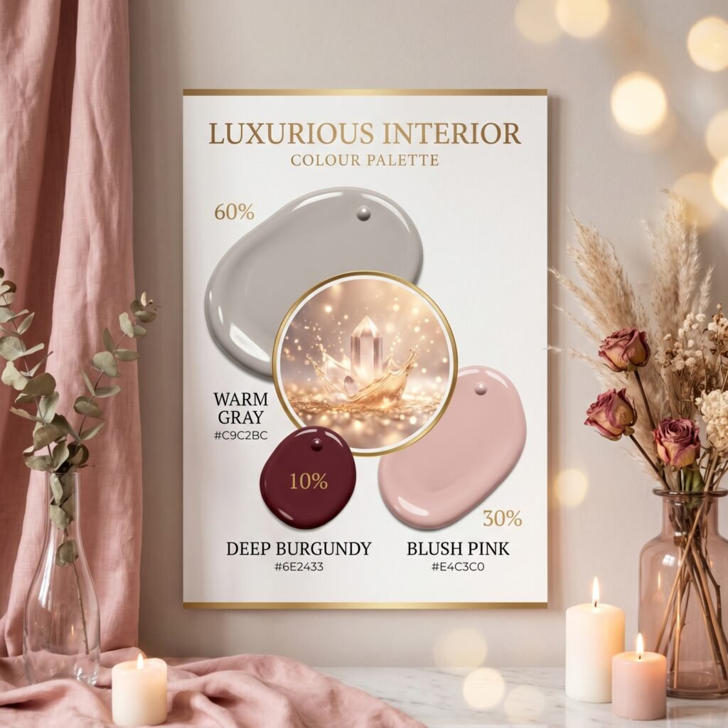
Soft and feminine with an unexpected rich accent.
- 60% Warm Gray (#C9C2BC) on the walls
- 30% Blush Pink (#E4C3C0) on bedding, curtains, or an upholstered headboard
- 10% Deep Burgundy (#6E2433) in cushions, a vase, or framed art
Best for: bedrooms, dressing rooms, and glam spaces.
6. Sand Beige + Caramel + Black
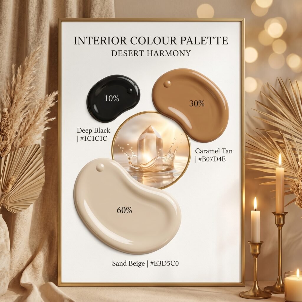
A desert-inspired minimalist look that feels effortlessly chic.
- 60% Sand Beige (#E3D5C0) on walls and large pieces
- 30% Caramel / Tan (#B07D4E) in leather furniture and rugs
- 10% Black (#1C1C1C) in frames, lamp bases, and slim hardware
Best for: modern living rooms and minimalist apartments. The black accent gives definition and structure.
7. Powder Blue + White + Coral
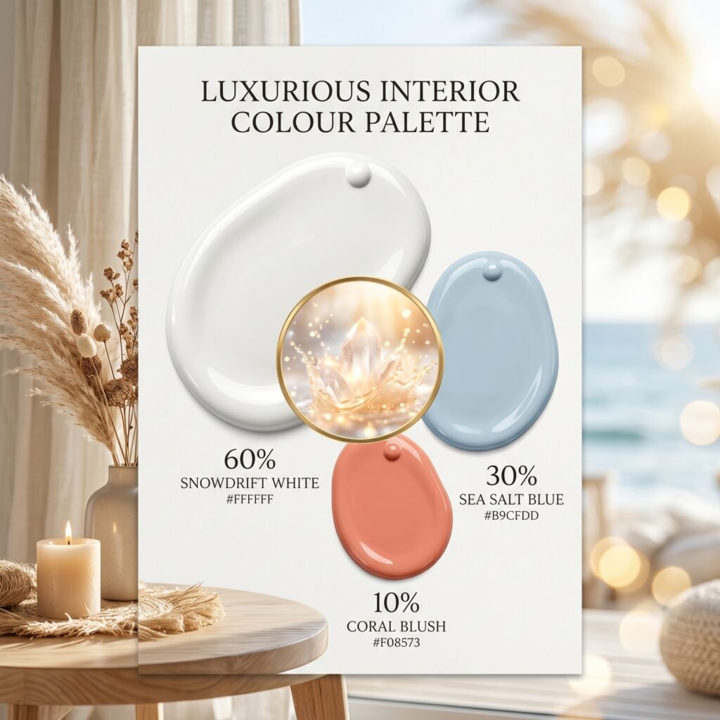
Fresh, airy, and full of light — perfect for a relaxed coastal feel.
- 60% White (#FFFFFF) on walls and trim
- 30% Powder Blue (#B9CFDD) on furniture or an accent wall
- 10% Coral (#F08573) in cushions, towels, and accessories
Best for: bathrooms, sunrooms, and breezy bedrooms.
8. Olive Green + Off-White + Burnt Orange
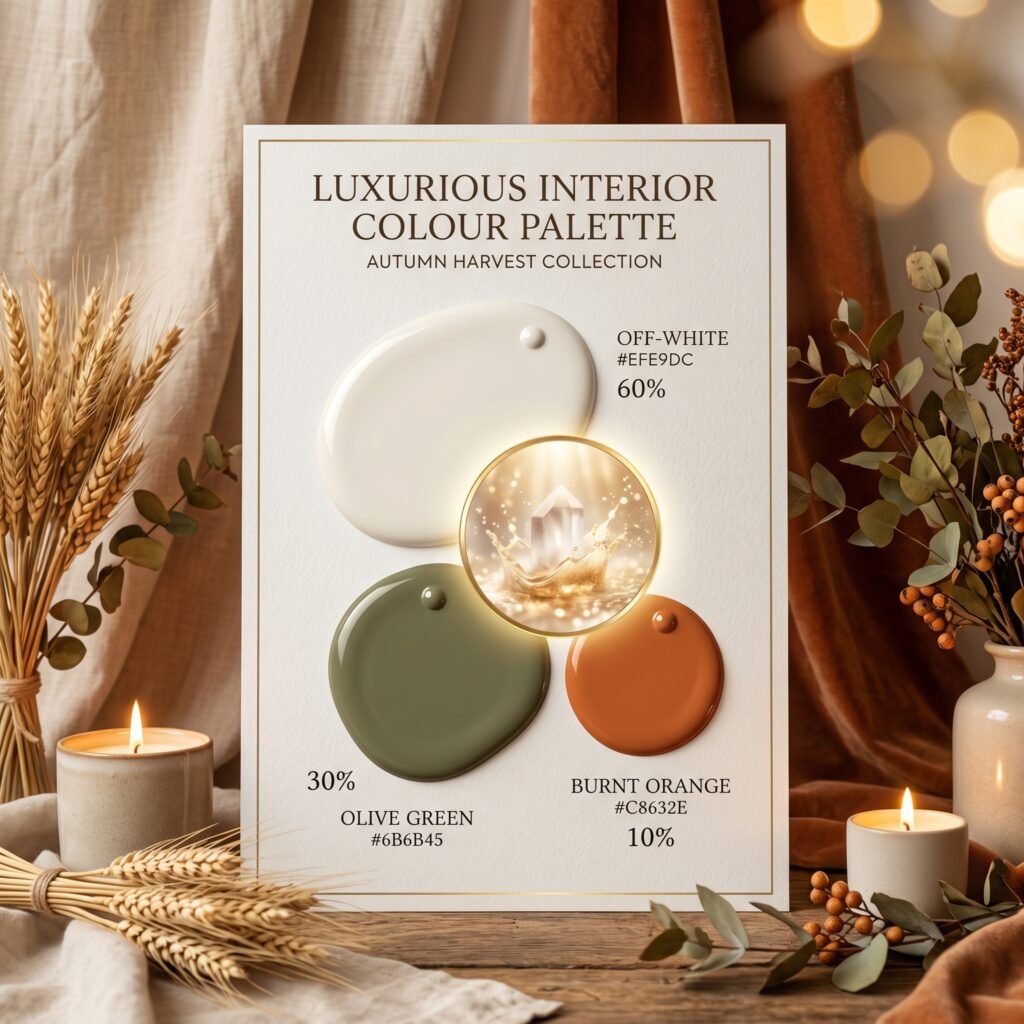
A warm, earthy palette that feels like a cosy autumn afternoon.
- 60% Off-White (#EFE9DC) on walls
- 30% Olive Green (#6B6B45) on a sofa, cabinetry, or accent wall
- 10% Burnt Orange (#C8632E) in throws, pottery, and lighting
Best for: living rooms, dining areas, and creative spaces.
9. Cream + Soft Lavender + Muted Plum
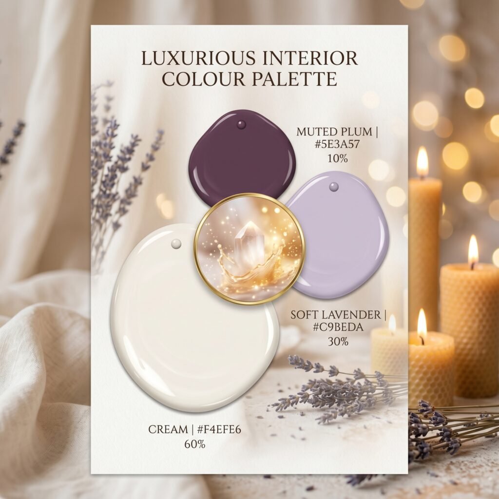
A gentle, romantic scheme that feels calm and dreamy.
- 60% Cream (#F4EFE6) on the walls
- 30% Soft Lavender (#C9BEDA) on bedding, curtains, or a headboard
- 10% Muted Plum (#5E3A57) in cushions, candles, and small decor
Best for: bedrooms and quiet retreats.
10. Light Gray + Dusty Blue + Soft Yellow
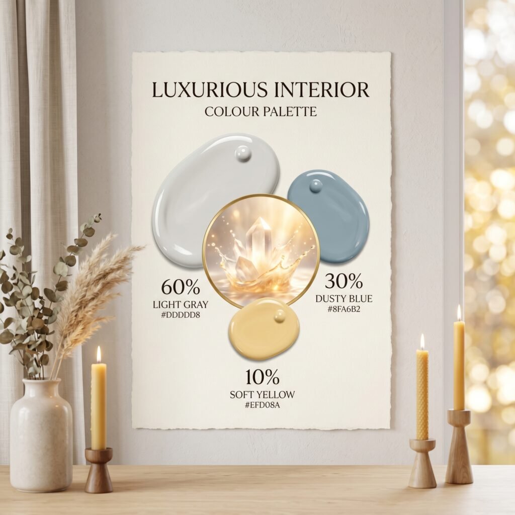
A bright, Scandinavian-inspired palette that feels clean and cheerful.
- 60% Light Gray (#DDDDD8) on walls and large surfaces
- 30% Dusty Blue (#8FA6B2) on furniture or a feature wall
- 10% Soft Yellow (#EFD08A) in cushions, art, and accessories
Best for: nurseries, kitchens, and bright family spaces.
11. Warm Ivory + Chocolate Brown + Teal
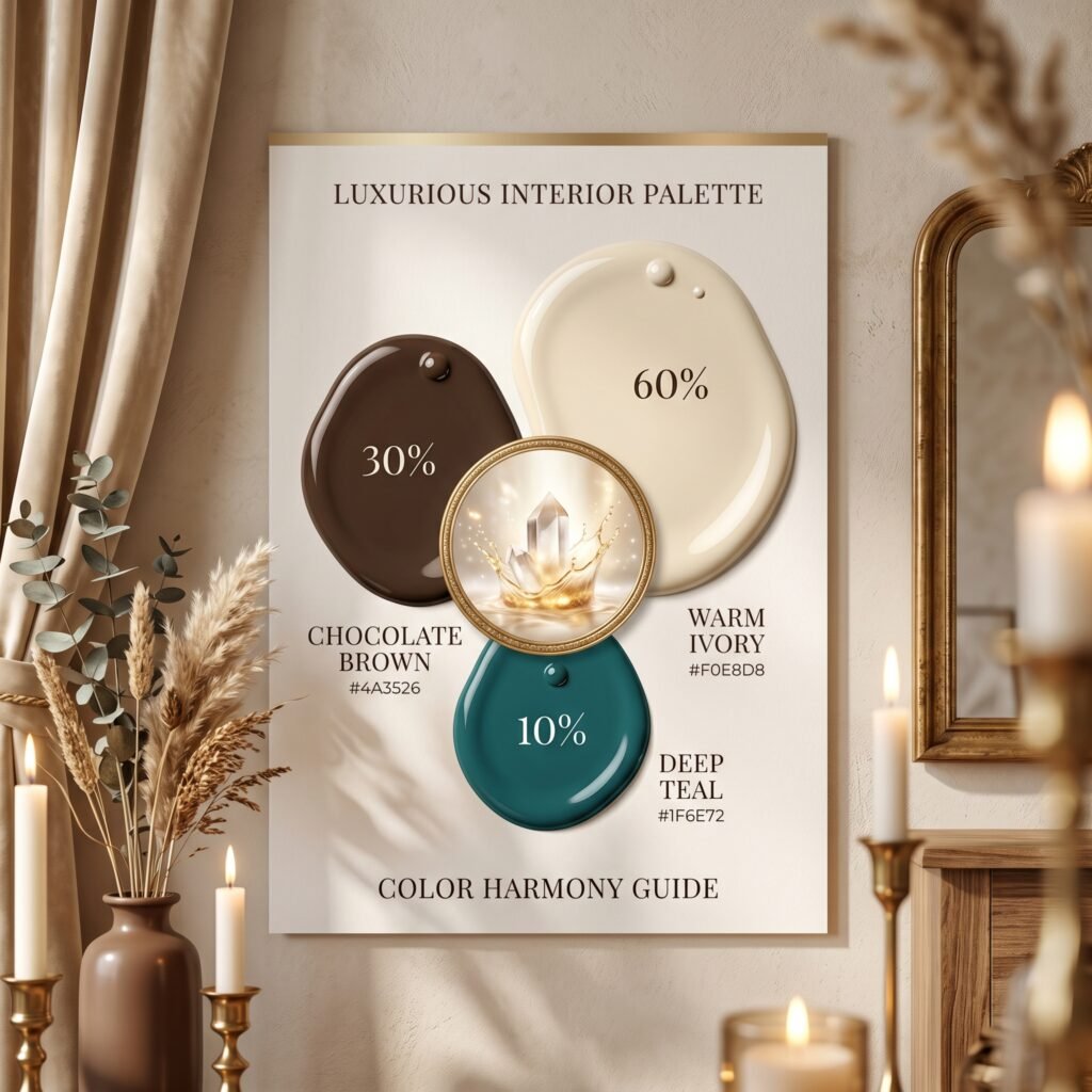
A rich, luxe combination with real depth and warmth.
- 60% Warm Ivory (#F0E8D8) on walls
- 30% Chocolate Brown (#4A3526) in furniture, wood tones, and a leather sofa
- 10% Teal (#1F6E72) in velvet cushions, a statement chair, or art
Best for: formal living rooms, libraries, and elegant dining spaces.
Quick Tips for Using These Palettes
- Start with your 60%. Pick the dominant colour first, then build the other two around it.
- Carry the 10% around the room. Repeat your accent colour in at least two or three spots so it feels intentional, not random.
- Test before you commit. Always view paint samples in your own room at different times of day — colours shift dramatically with the light.
- It works outside too. For exteriors, use the 60% on the main walls, the 30% on the roof or large trim, and the 10% on the front door and detailing.
Final Thoughts
The 60-30-10 rule is the easiest way to make any room look like it was put together by a professional. Whether you love calm neutrals, bold contrast, or soft romantic tones, there is a palette on this list for you. Save the combinations that speak to your style, and let them guide your next project — your dream home is just a colour palette away.
Which of these 11 combinations is your favourite? Pin your top pick and start planning your space today.